Update #13 - GUI infrastructure laid


I have actually implemented a good portion of the things I talked about in the last entry.
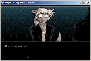
First of all, I tweaked the visual design of the message window a bit. A while back, someone mentioned it was a little difficult to tell the difference between the player character's internal monologue and spoken dialogue, so I made some changes to accentuate that.
Previously, the only difference between spoken dialogue and internal monologue was the fact that the name of the currently speaking character disappeared.
Now, spoken dialogue is in quotes, and character names are bold—while internal monologues are in parentheses, and not only contain no character name, but shift up to occupy that space.
I'm not sure what I think about having all the dialogue in quotes, but everything else works pretty good, I think, and makes the game look a little more professional.
In terms of actual new features and fixes:
The game does not consult your monitor size to decide how big to make its window yet, but the default size is now 720p, which is much more sensible than the old default.
I've coded a system for individual clickable areas to have "indicators"—small-ish graphics only visible during the point-and-click parts, designed to make the existence of invisible clickable areas more obvious. Currently, I haven't added them to many backgrounds, and I haven't drawn any new indicators, though. (As a placeholder, I just upscaled the arrow graphics I made for the mouse cursor.)
It is not used for a terrible lot yet, but I've coded a working menu system. It's got some rough edges, but gets the job done. Like, currently, there's no way to place sliders on options, so you can only change the volume through a menu, which is a little goofy. And hopefully you all will forgive me if the save game menus do not include thumbnails, as they do in fancier visual novels engines :p
In addition, I changed the instrumentation on quite a few music tracks, and made them quieter.
There's still a lot left to do, but this is a pretty nice step forward. Next up will be actually using these features I've coded—to, say, make an actual options menu, instead of the mockup I have currently.
(Or, perhaps, a debug/cheat menu, the absence of which has made testing pretty irritating :| )
Here's hoping I can actually stay productive.
Get Super Fuzzy Beach Dater Demo
Super Fuzzy Beach Dater Demo
Retro furry dating sim.
| Status | On hold |
| Author | TanteiSakana |
| Genre | Visual Novel, Adventure |
| Tags | Dating Sim, Furry, Pixel Art, Retro |
| Languages | English |
More posts
- A spinoff/sequel text game is outSep 26, 2019
- Spoiler Video #1Apr 03, 2019
- Stopping work on SFBDMar 31, 2019
- Internet troubles, but progress madeMar 03, 2019
- Demo 3 WIP Gameplay FootageFeb 04, 2019
- Vote to speed up development!Jan 02, 2019
- Slowing down developmentDec 09, 2018
- Update #23 - Sketching mermaid graphicsDec 02, 2018
- Update #22 - Starting mermaid routeNov 25, 2018
- SFBD Demo 2 Version 2Nov 18, 2018
Leave a comment
Log in with itch.io to leave a comment.